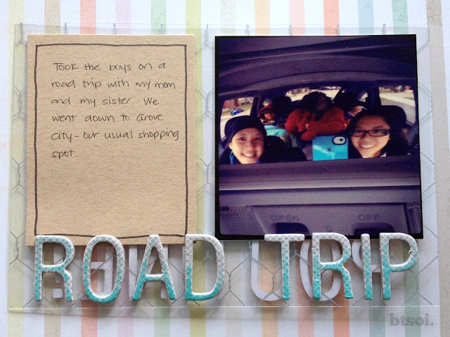
It's really too bad that Hambly Studios is no longer in business, because I've just discovered how much I love using overlays. I know, I'm super late to the game.
My absolute favourite is their chicken coop overlay. It's the perfect-sized pattern, not too busy and not too sparse. You can use it with just about any theme. I hope someone comes out with a similar product soon because I'm starting to run out.
I like using overlays in Project Life because it adds a bit of variety. What you see on that page isn't just restricted to that week. You can see through to the next (or previous) week, too! The thing with that, though, is if you're like me, you get a little picky and you have to pay attention to what's on the other side.
The first time I used an overlay in my Project Life was for my birthday insert. I carefully chose a background and left the back of the overlay untouched.
This time, I wanted to try putting something on both sides of the overlay. To make sure it didn't look too busy, I backed each element with a matching piece directly on the other side. However, I found that the titles didn't stand out enough because obviously, the letters couldn't be matched exactly on either side.
To fix that, I inked up the Thickers a little. I didn't want to completely cover the entire Thicker in ink, so I started at the bottom and faded it upwards to give it an ombré effect.
Here's how it turned out:
And the other side:
I'm really happy with how it turned out and I can't wait to use overlays again.


Ohhh I love what you did with your Amy Tan thickers!!!!!!
ReplyDelete