At Nathan's school, students are allowed to choose the work they do. I've noticed that Nathan tends to gravitate towards writing and sometimes math but never any of the more artistic activities. After our afternoon of painting, I could see Nathan really enjoys art. To expose him to a bit more of it, and give him a better understanding of the basics of colour and texture, I created this quick little project for him.
I'm always so surprised when Nathan approaches these projects with so much enthusiasm. I thought he would get this project over with as fast as possible, but he actually took his time and put a lot of effort into each page.
School Holiday Project No. 1: The Colour Book
I had a general idea of what I wanted to cover in this project. I cut pieces of thick paper into rectangles, drew the foundations of each page and let Nathan do all the work while I explained what to do on each page.
I let him work on his title page. This part took a little longer than I thought it would, which is a really good thing because that meant Nathan was really getting into this project.
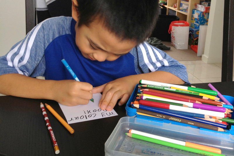
Then, we talked about primary colours.
We recently bought an optics set that came with these colour paddles. Nathan used those to figure out which colours combined to create the secondary colours.
He quickly coloured the rainbow colour wheel and then spent a lot of time decorating the 'warm and cool' page with patterns using the different types of colour.
We took a quick look at different textures and finished the project before he got bored.
Ta-da!
Nathan stapled it together the way he wanted and that was it! His very own colour book.
Showing posts with label Tutorial. Show all posts
Tuesday, April 16, 2013
Thursday, October 13, 2011
Misted Skyline
I received a comment asking how I misted the Toronto skyline on my mini album cover so I thought I'd write a post to share how I did it.
I started off by Googling "Toronto skyline" and chose a picture I liked.
I made the masks using that picture as a reference.
I sketched the outlines on some scrap paper, then it out with a hobby blade. As long as you use paper that's a bit thicker so that it holds its shape and doesn't let the ink soak through, you should be fine.
For the first mask (my background) I chose 4 buildings - two landmark structures and two tall buildings. I wanted to keep this one pretty simple.

Then, I drew a second mask that was more detailed with lots of little buildings. Having buildings of different heights, widths and shapes will add interest. I tried to follow the picture pretty closely but you can be creative here.

Now the fun bit.
Remembering back to my days of watching Art Attack (any other 90's kids out there?), I knew that the background silhouette should be lighter than the foreground, so I misted that one first.
After adhering the mask to my cover, I did a light but even mist of the background. If I had been thinking clearly, I would have done some practice sprays on some scrap paper for a more even coverage, but I'm okay with the splotches.

I let it dry for a bit, all the while wondering whether I should continue on with my original plan and mist the foreground, or leave it as is. I liked the look, but it was a kind of sparse, so I continued.
I lined up the second mask with the first misted image and adhered it down - super important, remember to put adhesive on the little detail parts because if mist gets under, your image won't be as clean and crisp (so I've learned).
Then, I misted this one until it was as dark as I wanted it to be.
Note: at this point, try to contain your excitement and let your project dry a bit before you peel off your mask or you might end up pulling part of the paper off with it. Like I did. I just wanted to see if my idea worked! Luckily, I glued it back on with a bit of Tombo mono multi glue and now you can't even tell.
Hope this mini tutorial was helpful. If you try this out, leave me a link to your project! I'd love to see what you make.
I started off by Googling "Toronto skyline" and chose a picture I liked.
Source: bestourism.com via Bernice on Pinterest
I made the masks using that picture as a reference.
I sketched the outlines on some scrap paper, then it out with a hobby blade. As long as you use paper that's a bit thicker so that it holds its shape and doesn't let the ink soak through, you should be fine.
For the first mask (my background) I chose 4 buildings - two landmark structures and two tall buildings. I wanted to keep this one pretty simple.
Then, I drew a second mask that was more detailed with lots of little buildings. Having buildings of different heights, widths and shapes will add interest. I tried to follow the picture pretty closely but you can be creative here.

Now the fun bit.
Remembering back to my days of watching Art Attack (any other 90's kids out there?), I knew that the background silhouette should be lighter than the foreground, so I misted that one first.
After adhering the mask to my cover, I did a light but even mist of the background. If I had been thinking clearly, I would have done some practice sprays on some scrap paper for a more even coverage, but I'm okay with the splotches.

I let it dry for a bit, all the while wondering whether I should continue on with my original plan and mist the foreground, or leave it as is. I liked the look, but it was a kind of sparse, so I continued.
I lined up the second mask with the first misted image and adhered it down - super important, remember to put adhesive on the little detail parts because if mist gets under, your image won't be as clean and crisp (so I've learned).
Then, I misted this one until it was as dark as I wanted it to be.
![]() |
| The image becomes less blotchy as the ink dries. |
Note: at this point, try to contain your excitement and let your project dry a bit before you peel off your mask or you might end up pulling part of the paper off with it. Like I did. I just wanted to see if my idea worked! Luckily, I glued it back on with a bit of Tombo mono multi glue and now you can't even tell.
Hope this mini tutorial was helpful. If you try this out, leave me a link to your project! I'd love to see what you make.
Categories:
Papercrafts,
Tutorial
Thursday, September 22, 2011
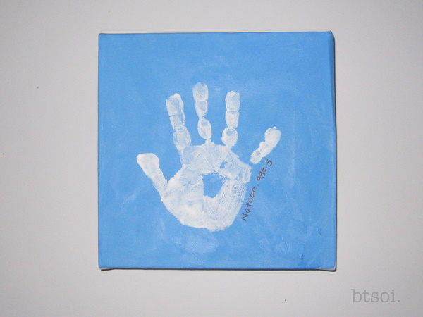
Handprint Canvas Tutorial
We've been looking for some simple and affordable ways to make this rental apartment look and feel a little more like our home so when I found canvases on sale for 50% off, I bought a bunch. I wasn't sure exactly what I'd do with them since I'm not much of a painter, but they were so cheap, it wouldn't really matter so much if I made mistakes on them.
When I was in kindergarten, we made little handprints by pressing our hands into a plate of drying plaster. I thought I'd do the same except with paint - home decor and keepsake all in one!
Handprint Canvas
You'll need:
- a small canvas (mine was 8"x8")
- acrylic paint (1 colour for your background, one for the handprint)
- black permanent marker (optional, for writing child's name and date/age)
- paint brush
Directions:
1. Paint the entire canvas with the background colour and let it dry. We covered our work surface to catch the drips!

2. When the canvas is dry, then comes the fun (read: messy) bit. Paint your child's hand with the handprint colour. We watered the paint down a little so it wouldn't dry too quickly and we laid on a generous amount of paint. Not too much, though, or you might end up with a big blob instead of a handprint.

3. Have the child press their hand down on the canvas. I went and individually pressed down each finger, just to be sure it would show up.

4. Let the print dry.

5. Then take your permanent market and write the child's name.

Tada!
When I was in kindergarten, we made little handprints by pressing our hands into a plate of drying plaster. I thought I'd do the same except with paint - home decor and keepsake all in one!
Handprint Canvas
You'll need:
- a small canvas (mine was 8"x8")
- acrylic paint (1 colour for your background, one for the handprint)
- black permanent marker (optional, for writing child's name and date/age)
- paint brush
Directions:
1. Paint the entire canvas with the background colour and let it dry. We covered our work surface to catch the drips!
2. When the canvas is dry, then comes the fun (read: messy) bit. Paint your child's hand with the handprint colour. We watered the paint down a little so it wouldn't dry too quickly and we laid on a generous amount of paint. Not too much, though, or you might end up with a big blob instead of a handprint.

3. Have the child press their hand down on the canvas. I went and individually pressed down each finger, just to be sure it would show up.
4. Let the print dry.
5. Then take your permanent market and write the child's name.
Tada!
Subscribe to:
Posts (Atom)